How’s It Hanging? Pt. II
For Part II of our How’s It Hanging series, (I just thought of the title. Is it clever or crass?) we’ll focus on art displays in foyers, nooks and corners. It’s the small vignettes you set up here and there I think that come together and form the overall statement of your space. Focusing on your entire home, or even one room, can be overwhelming. Where do you start? Try breaking things down into smaller pieces instead. And whatever you do, don’t forget the art!
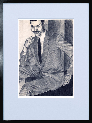
On the left is a chic corner bar setup by Style At Home. Featured are two selections from the VINTAGE COLLECTION. RENAULD and TAKING CARE OF BIZNESS. Shown at 15.75 x 19.75 inches, they look great here, don’t you think? Sometimes color just isn’t necessary. And then sometimes it so IS. On the right is DOROTHY, also from the VINTAGE COLLECTION, shown at 27.5 x 19.75 inches. One of my favorite color combos, nothing adds snap like black, white and a healthy shot of red.
Here on the left is a welcoming little nook just outside the kitchen. Delicate drawings from PENCILS, both at 15.75 x 19.75 inches, add elegance and whimsy while you and your bestie spend Sunday afternoon drinking coffee and kicking around ideas on how to save the world. Or at least rescue a friend from yet another lousy relationship. On the right is a completely different vibe from Denise Smith Design. It’s red, white and black again but now with an Oriental flair. This print is called ON VACATION from the CROQUIS COLLECTION. Shown at 19.75 x 27.5 inches, it’s clean and graphic minimalism compliments but not too seriously. Just how serious can jangly ankle bracelets be?
Now imagine these four scenes with bare walls. Okay? You get the picture (ha-ha). They’re nice enough on their own but add to the mix the perfect piece of art, the one that makes your heart sing and BAM! The excitement is unparalleled and the difference—like night and day.
I neglected to spotlight a piece from the Gallery last Monday but I believe this one will make up for it. Ah…RENAULD. Renauld White. They called him Rennie. Remember him? He was the premiere African-American male model of his day, the first to grace the cover of GQ magazine. I created this piece in 1980-81, keeping him tucked away on my drawing table at work, in the back of my large layout paper pad, and whenever there was down time I worked on him. It took weeks to get the folds of his suit just right, the shading of his beautiful hands just so. Wasn’t he fine? I saw pix of him a few years ago and he’s still fine.
I’ll bet there’s a corner in your home that stands empty and forlorn, isn’t there? A little nook that begs to be brought to life, like your very own episode on HGTV, with just a small table, a few knick-knacks and a fabulous and fun illustration. Take a look around—
And welcome to the FASHION+ART Online Gallery.


Really a nice rendering,a nice touch with the pencil!
Thank you, djs.